UX / UI Design · Data & Analytics
The most frequently used interface in the product — yet it consistently failed its users. No item-level data, no reliable channel breakdown, no way to act on what mattered. This project rebuilt it from the ground up.
The dashboard was the first screen customers saw every day. Yet it consistently blocked rather than enabled decision-making. Three questions kept surfacing across every research touchpoint:
Which of my products is actually profitable?
No item-level data. No way to break down margin by SKU or channel.
Which of my channels are underperforming?
No marketplace-level filtering. Inactive channels mixed in with active ones, cluttering the default view.
What should I act on today?
No clear hierarchy. An overloaded default view with no way to edit, prioritise, or filter meaningfully.
The result: low adoption, poor data trust, and users increasingly relying on external tools like Sellerboard to fill the gap.
To build a shared understanding across product, engineering, and design before touching any frames, I ran two research tracks in parallel.
Customer Interviews
Five interviews with customers and one partner agency. Findings synthesised into an affinity map identifying the key pain clusters.
CSD Workshop
A Certainties, Suppositions, and Doubts session with the cross-functional team to surface assumptions and align on unknowns before any design decisions were made.
Usability
The default view was overloaded with channels users weren't selling on. Most users didn't even know the dashboard could be edited — they were creating workarounds in MyView instead.
Data trust
Inconsistencies between the old and new dashboard versions eroded confidence. Without a clear data refresh cadence, managers couldn't rely on what they were seeing.
Missing capabilities
Users needed item-level data, marketplace filtering, and integrations with tools like Google Analytics, Google Ads, and Sellerboard. None were available.
Performance
Heavy MyView configuration was causing slow load times — a frustrating experience before users even reached their data.
CSD Matrix — Certainties, Suppositions, and Doubts from the discovery workshop
During alignment sessions, it became clear that data discrepancies flagged by users weren't a front-end problem — they sat with data engineering, who were mid-way through a separate pipeline project. Designing for a backend that didn't exist yet would be wasted effort.
Rather than pause, we scoped deliberately: build an MVP that worked within current constraints, and design ahead for what would come next — without shipping it.
MVP scope
Designed ahead, not shipped — MVP 2
Before defining the design direction, I reviewed competitor products and established UX best practices for BI dashboards to pressure-test assumptions from user research. I analysed over five competitors and reviewed numerous articles on effective dashboard design.
Three key takeaways shaped the direction:
Confirmed — clarity beats customisation
Top dashboards lead with high-level insights first, then layer detail via progressive disclosure, global and local filters, and generous whitespace to reduce cognitive load.
Challenged — don't design for every persona
Early assumptions pointed toward a flexible, multi-persona dashboard. Competitor research challenged this: designing for edge cases leads to complexity that serves no one well. Only surface data that truly meets core user needs.
Validated — build-your-own is a nice-to-have
'Build your own dashboard' features consistently appear as a power-user edge case, not a core expectation. Removing this as a priority was well-supported by what the market showed.
User interviews and market research revealed multiple stakeholders touching the dashboard: logistics, finance, customer care, product management, and business development. But one primary persona emerged — the E-Commerce Manager. Responsible for daily performance monitoring, channel optimisation, and short-term planning. She needs fast answers, reliable data, and actionable breakdowns.
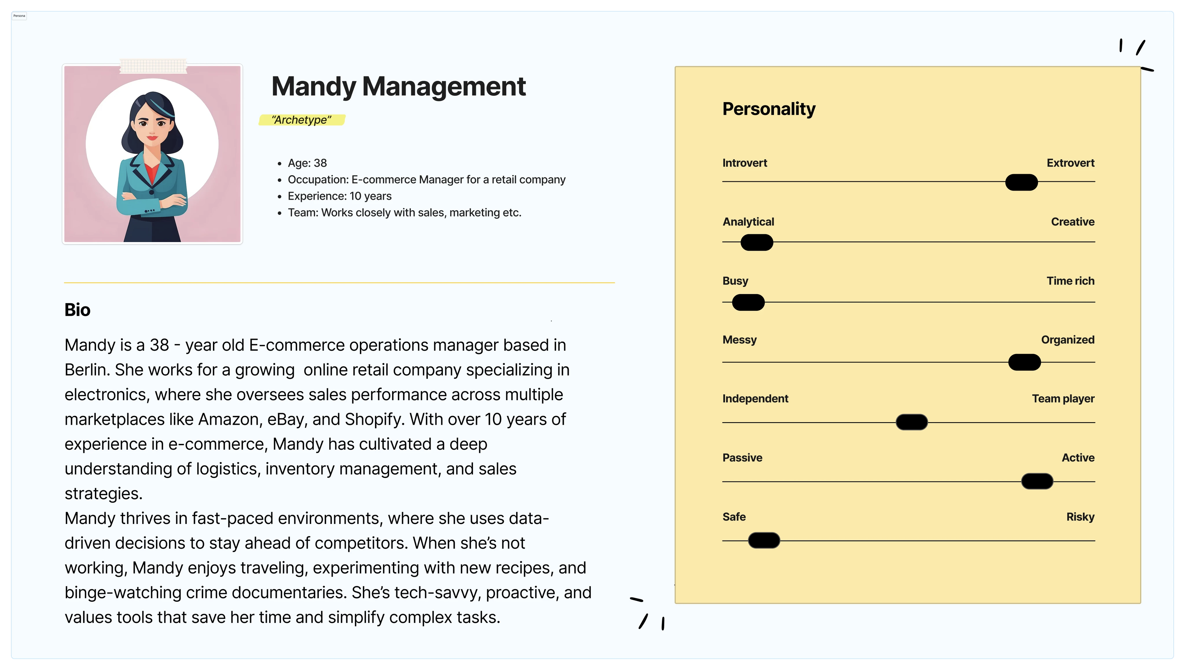
Mandy Management — 38-year-old E-Commerce Operations Manager, data-driven, busy, and highly analytical
The optimal user journey maps Mandy's daily workflow across four stages: Awareness, Investigating, Planning, and Execution. Starting with a morning health check of marketplace and product performance, drilling into underperforming channels, planning adjustments based on detailed insights, and executing changes directly from the dashboard.
The journey map was also used as a design critique tool — identifying where the existing dashboard broke down (investigation and planning stages) and where improvement opportunities were highest.
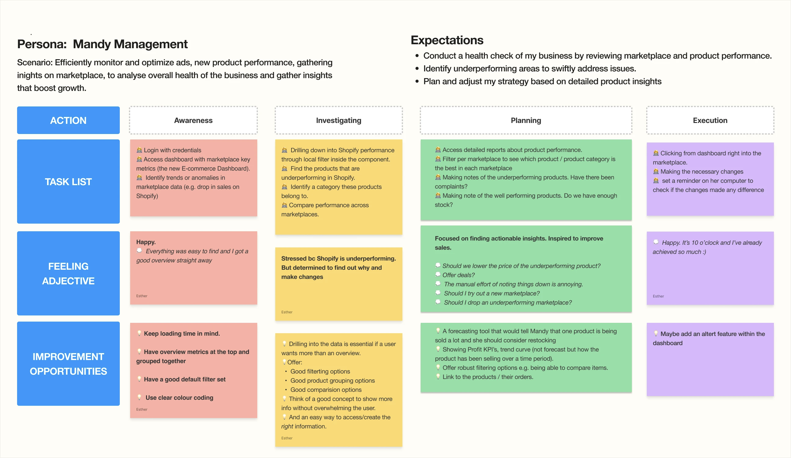
Optimal user journey — Awareness → Investigating → Planning → Execution, with tasks, feelings, and improvement opportunities mapped at each stage
Before committing to a direction in Figma, I used Google Stitch and Gemini to rapidly explore layout approaches, information hierarchies, and visual systems. This let me pressure-test multiple directions in hours rather than days.
The competitor analysis ran alongside this — five leading BI dashboards were audited to understand interaction patterns users already knew. The key insight: clarity beats customisation. The best dashboards lead with high-level insight and layer detail on demand. Build-your-own was a power-user edge case, not a core expectation.
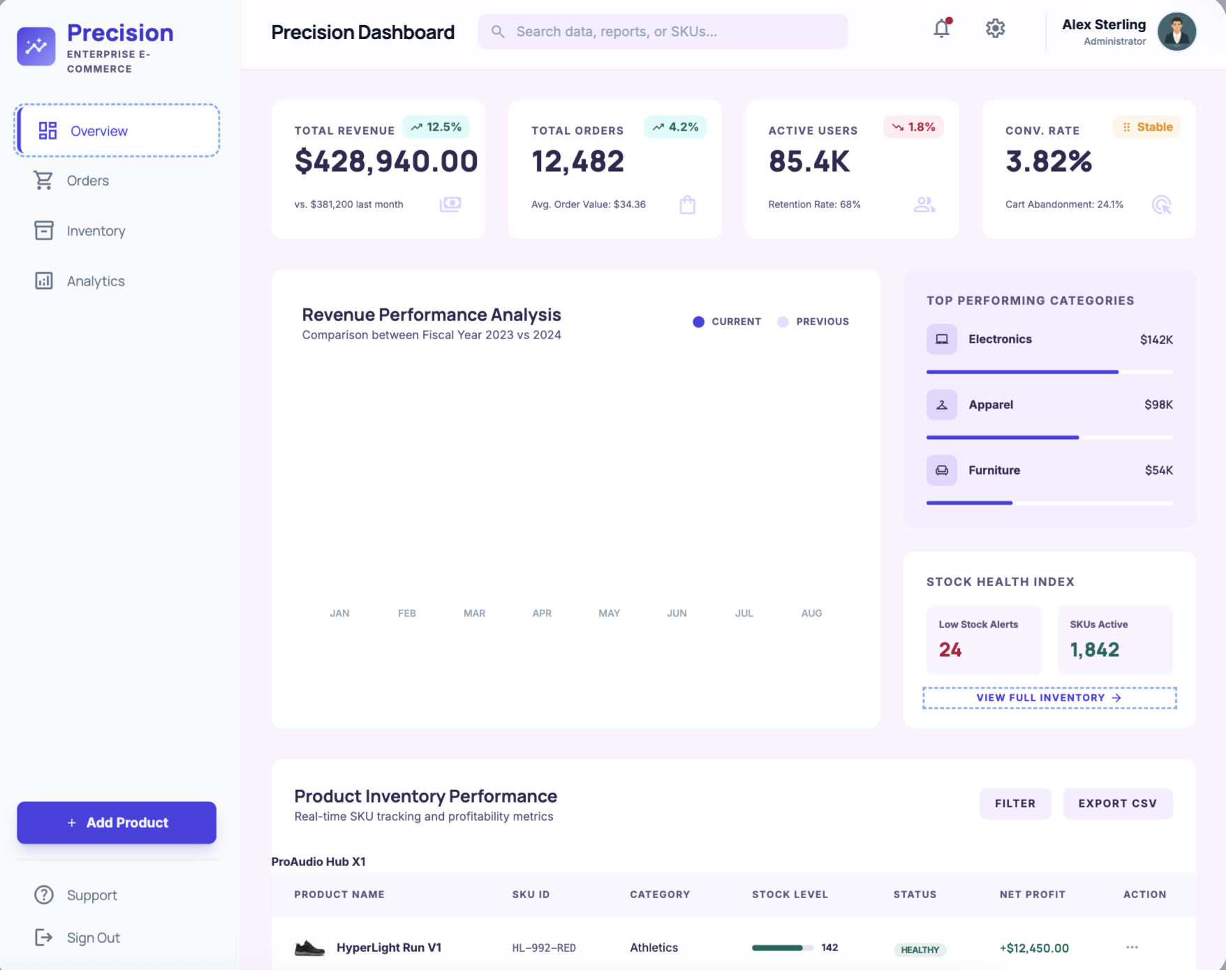
Exploration 1 — Precision Dashboard, compact layout
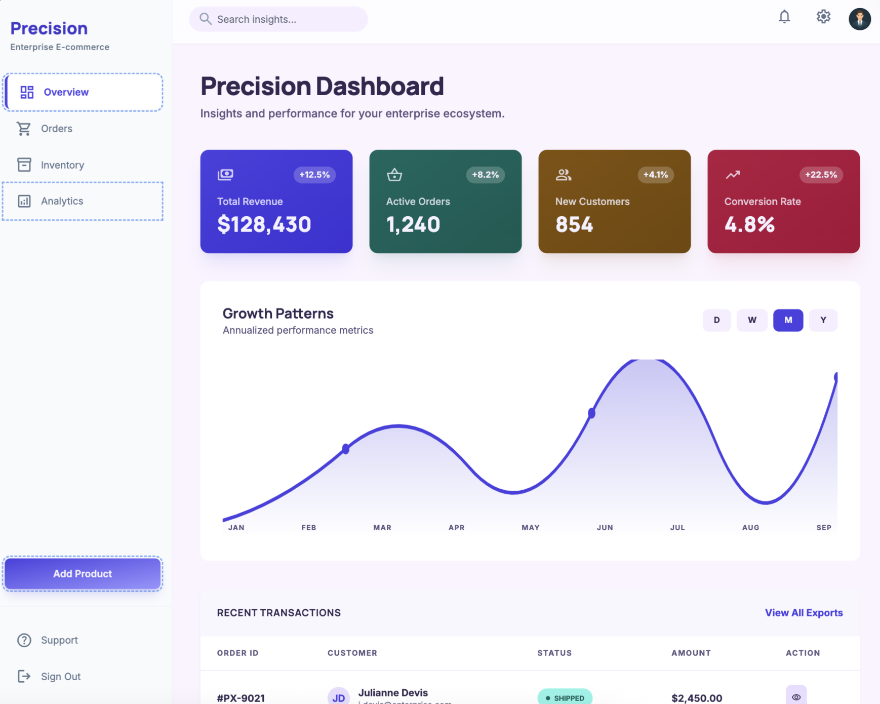
Exploration 2 — coloured KPI card variant
Exploration 3 — OmniERP channel-first layout
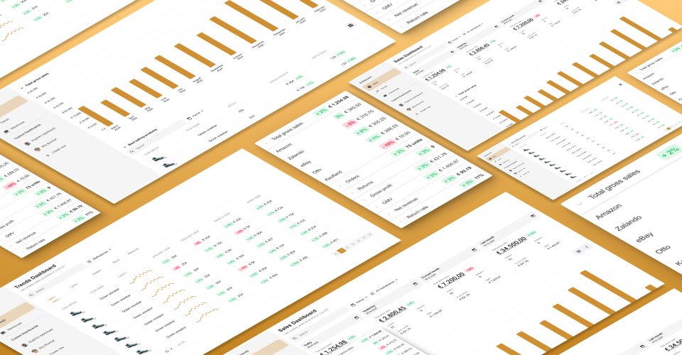
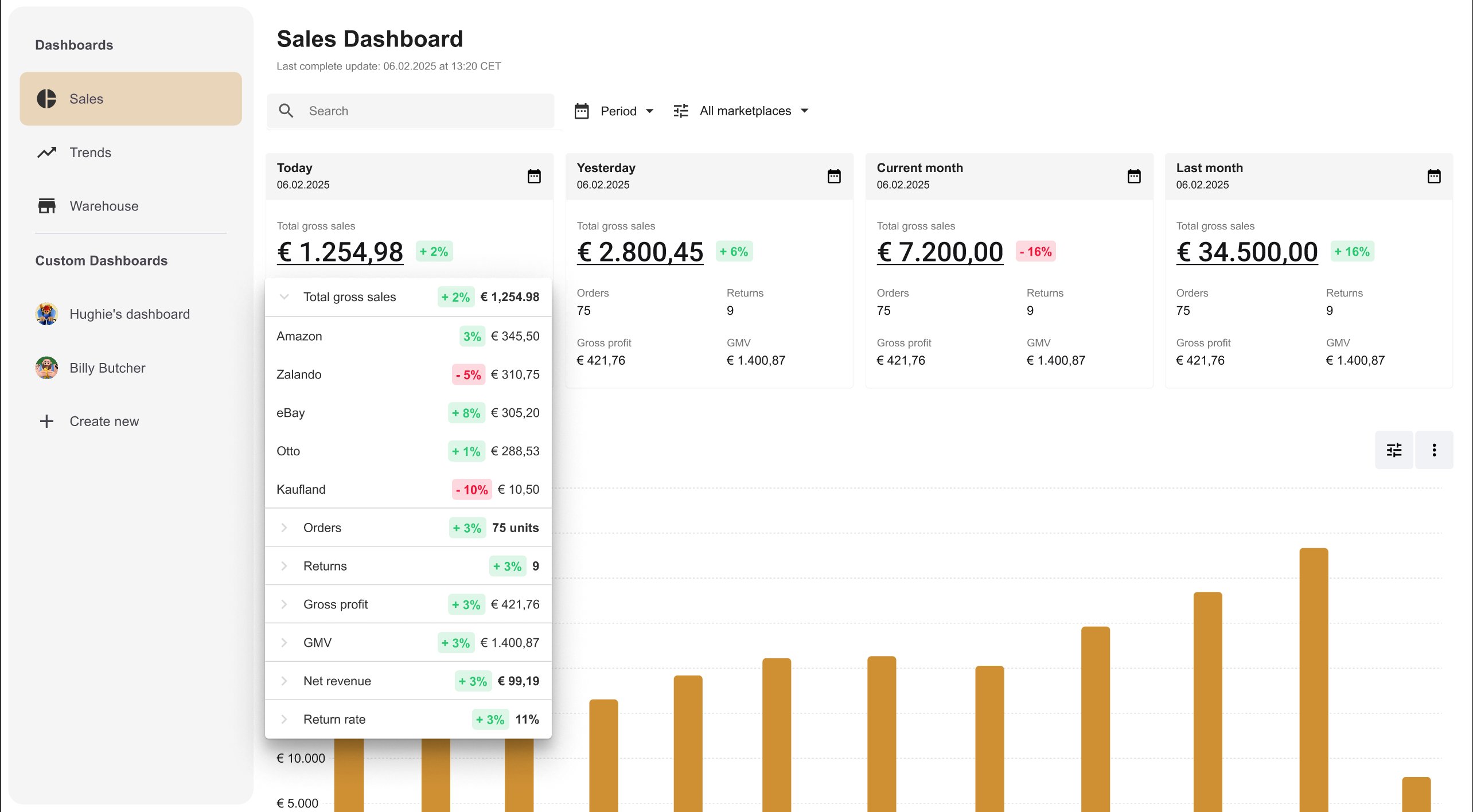
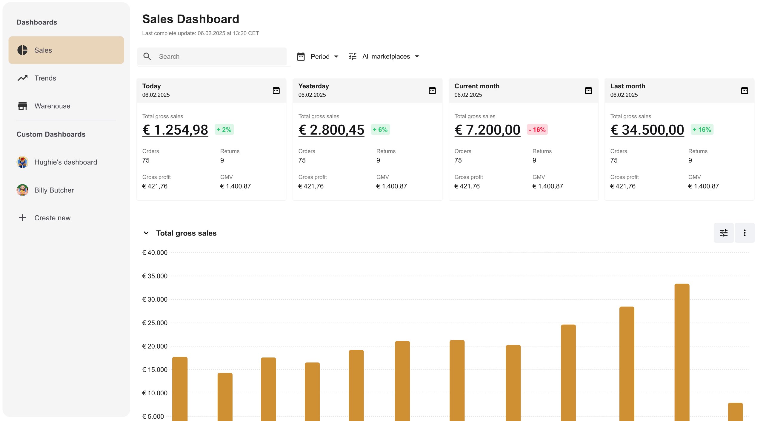
The final design centres on a four-card KPI summary at the top — Today, Yesterday, Current month, Last month — each showing total gross sales with a percentage delta. Below, a total gross sales bar chart gives temporal context, followed by the best-selling products table with item-level profitability data.
Every view is filterable by period and marketplace. The layout respects the way managers actually work: scan the headline numbers first, then drill into what needs attention.

The Sales Dashboard — four KPI summary cards, total gross sales bar chart, and best-selling products table
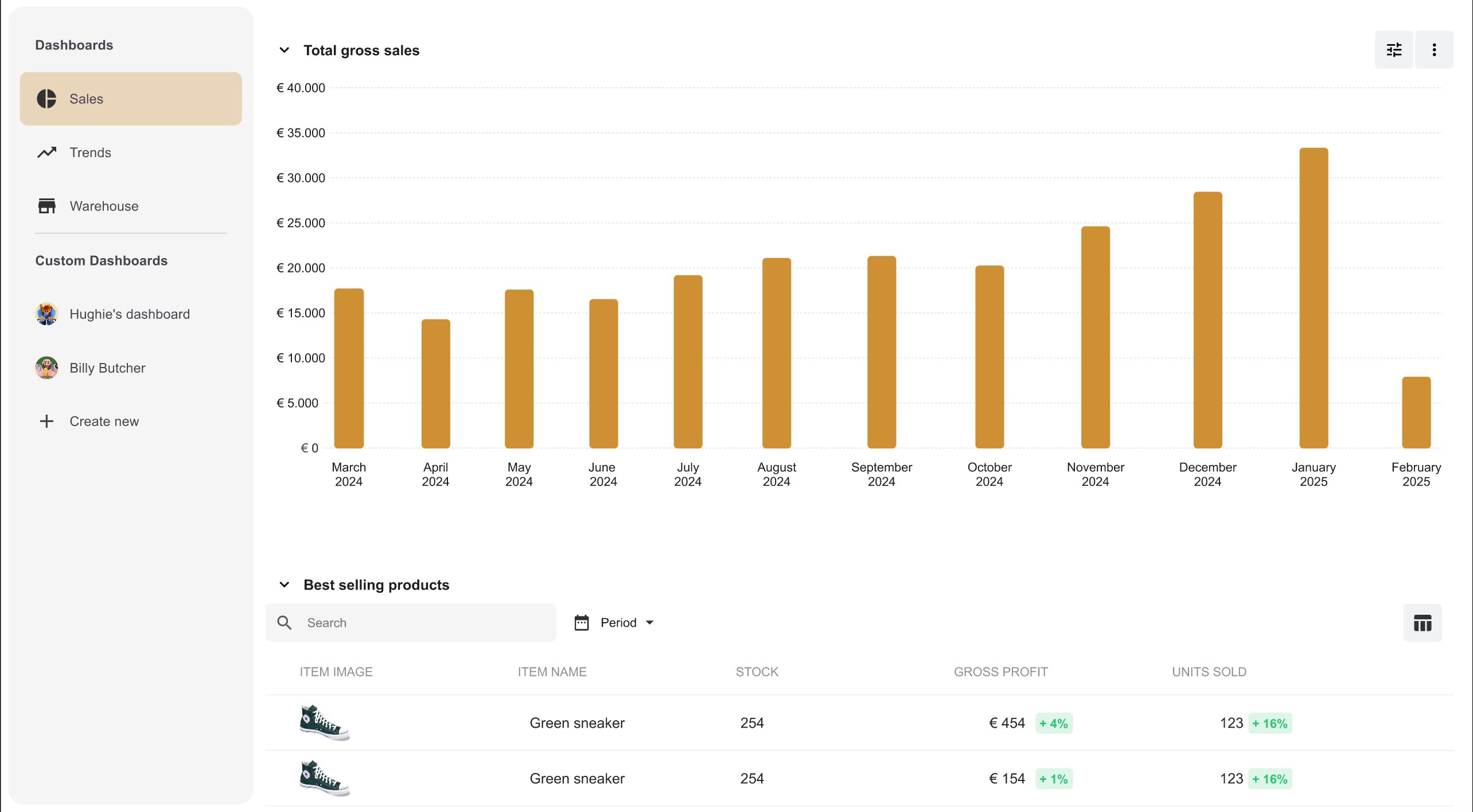
Total gross sales over time with the best-selling products table below — item-level stock, gross profit, and units sold
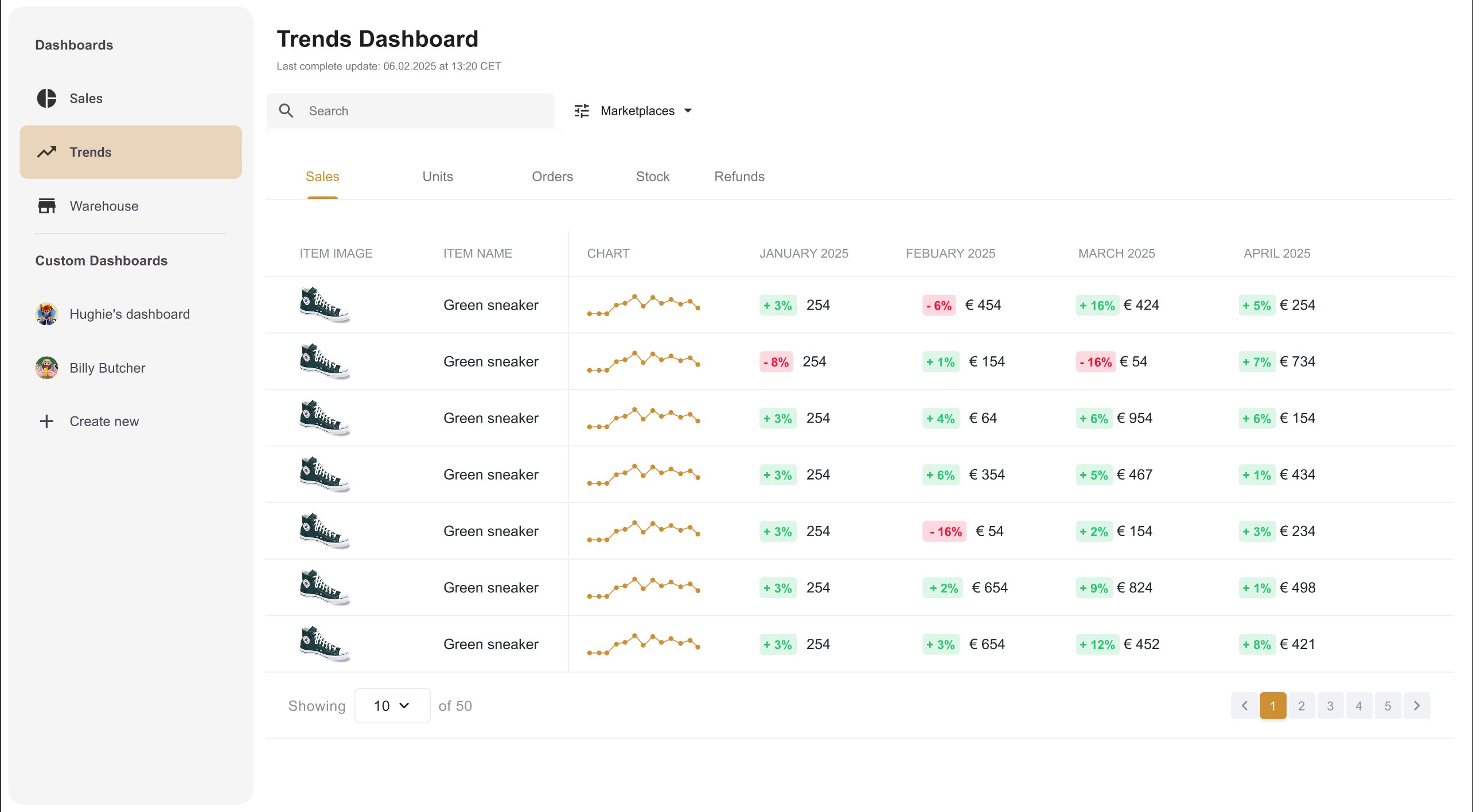
Trends Dashboard — item-level monthly sales comparison across marketplaces, with inline sparklines and period-over-period deltas
After the initial design was complete, I tested the prototype with six customers before handoff. The goals: assess comprehension of the dashboard data, and test discoverability of the marketplace filter and the rich tooltip on KPI cards.
Overall impression was strong
Users found the new interface significantly more structured and easier to navigate compared to the existing dashboard. The card-based hierarchy was immediately understood.
Tooltip discoverability was low
Most users clicked the number directly, not the dedicated button. Fix: the button was removed and the numbers themselves became the clickable entry point to the marketplace breakdown.
Trends was hard to find
Users expected item-level trend data within the Sales view, not a separate nav item. Fix: quick links to the Trends page were added directly within the Sales Dashboard.
Before — tooltip triggered by a dedicated button that users consistently missed
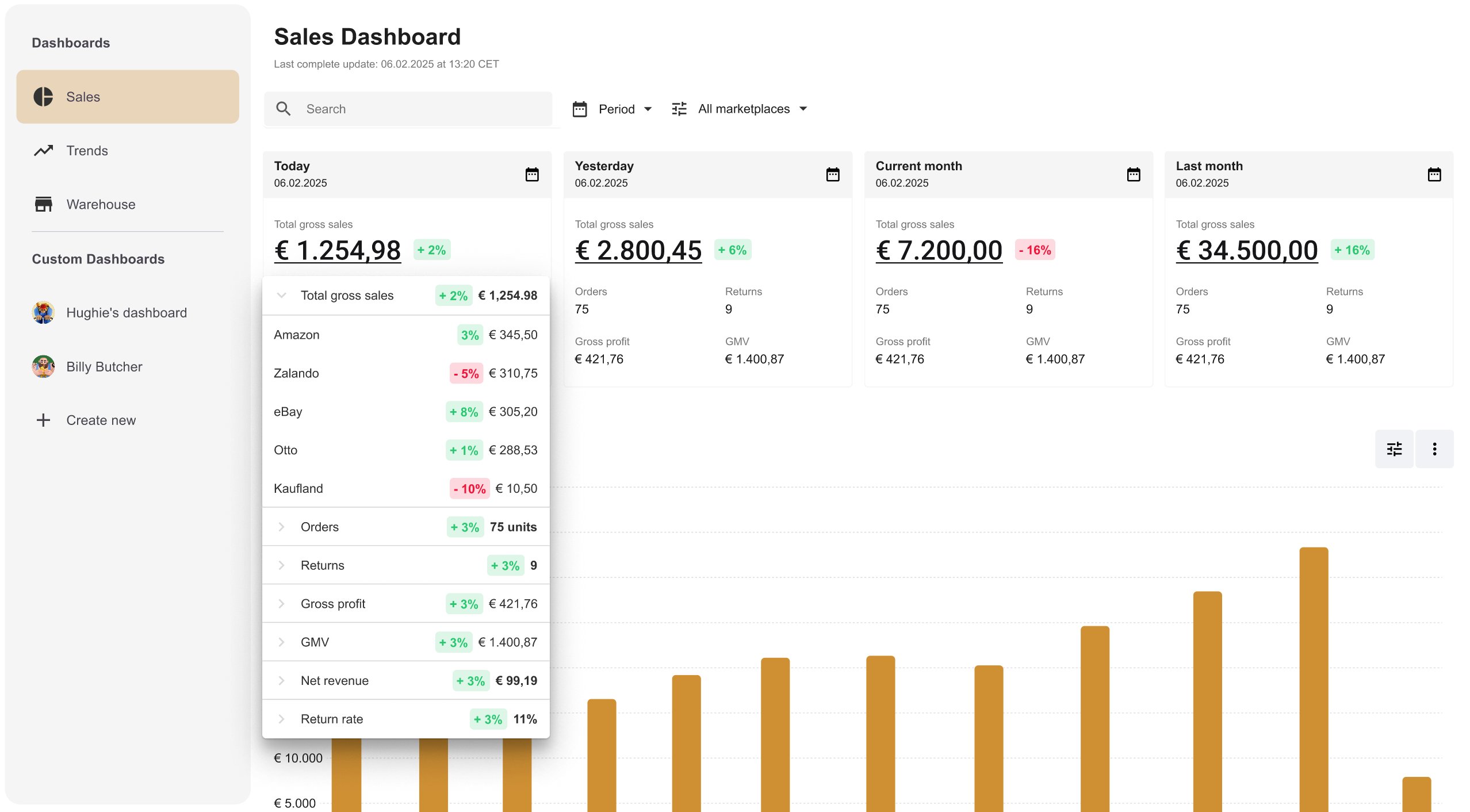
After — button removed, clicking the number directly opens the marketplace breakdown
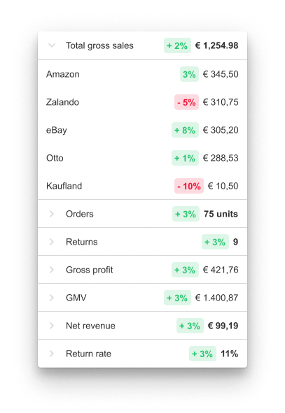
The tooltip in detail — per-channel sales with percentage deltas, expandable metric rows
Final design after user testing — tooltip interaction updated, Trends quick links integrated
A short walkthrough of the final design — from the KPI summary cards through to the marketplace tooltip and Trends navigation.