UX / UI Design
Automation was critical to our product — but the experience was split across multiple legacy modules, complex, and built on outdated technology. This project rebuilt it from the ground up.
New users struggled to adopt automation, and support requests kept increasing. The existing system couldn't scale to support more advanced workflows or compete with modern automation tools.
This project focused on rebuilding automation from the ground up — unifying functionality into one UI, improving the experience, expanding supported use cases, and creating a scalable foundation for future development.
The project was driven by a tight timeline, with expected delivery within 3 months. This limited the ability to conduct extensive discovery and required a focus on fast iteration and continuous validation.
Given these conditions, I followed a Lean UX approach — Think, Create, Validate — complemented by targeted research and competitive analysis.
To understand the biggest pain points, I analysed support tickets related to automation. What stood out was not just the volume of requests, but the severity: many tickets described situations where core business operations were blocked — in critical workflows like order processing, shipping, and invoicing.
After collecting tickets from the last 4 months, I conducted affinity mapping with the product manager and lead developer to synthesise the pain points into themes.
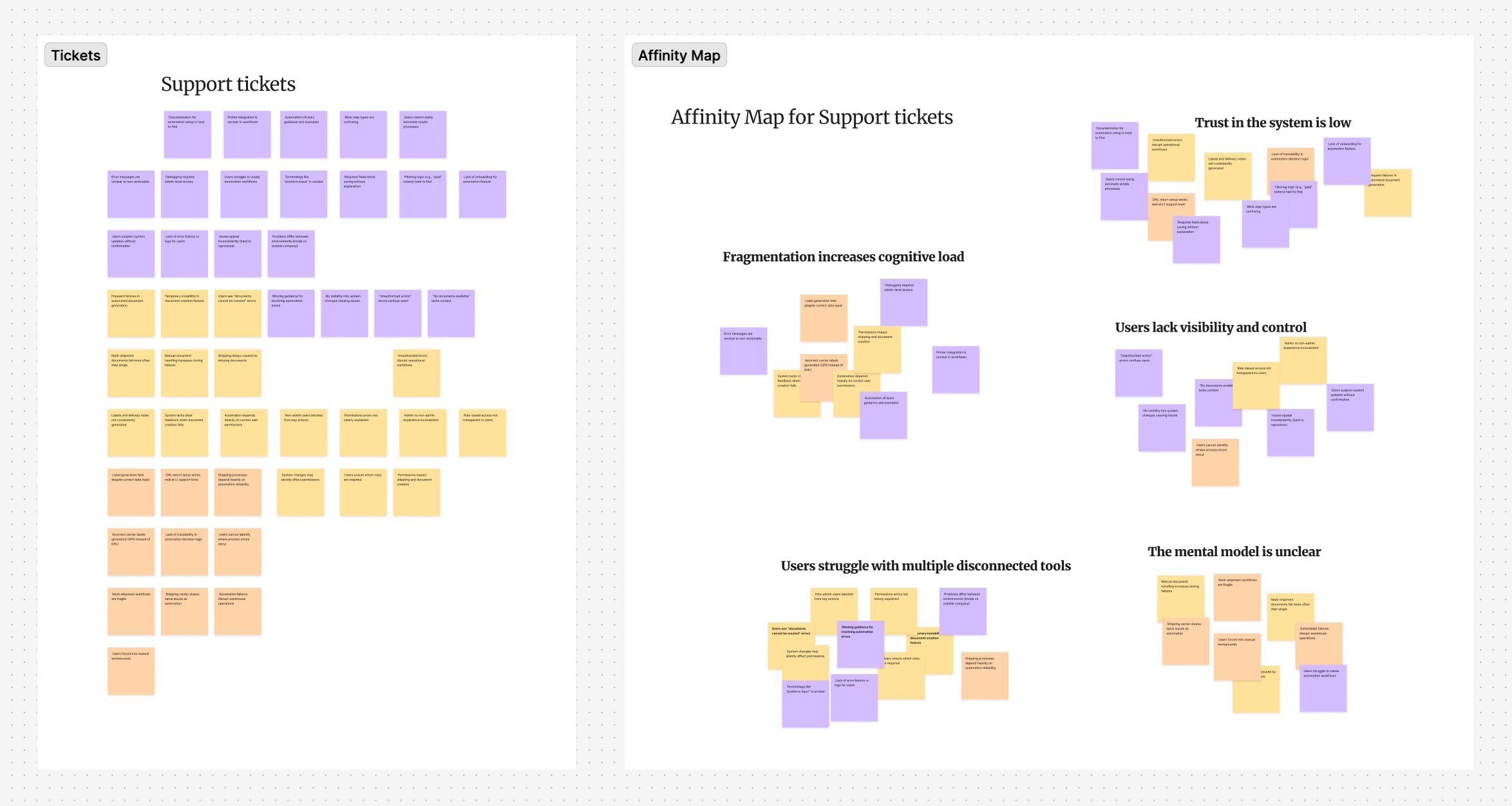
Support ticket analysis and affinity mapping — key themes: fragmentation increases cognitive load, users lack visibility and control, the mental model is unclear
To validate potential solutions, I analysed leading automation tools to identify interaction models users are already familiar with and reduce cognitive load by aligning with industry conventions.
Key takeaways: all tools start with a single trigger; drag-and-drop is the dominant interaction model; semantic colours signal errors and warnings; templates help onboard new users; and strong error management — visible in two locations simultaneously — is considered standard.
One of the key decisions was to replace three disconnected systems with a single unified interface. Previously, each trigger type had its own UI, logic, and entry point — forcing users to switch contexts to build workflows.
The new architecture centralises everything: view all automations in one place, create and manage flows from a single entry point, build workflows using a structured drag-and-drop canvas, and monitor all running automations from one source.
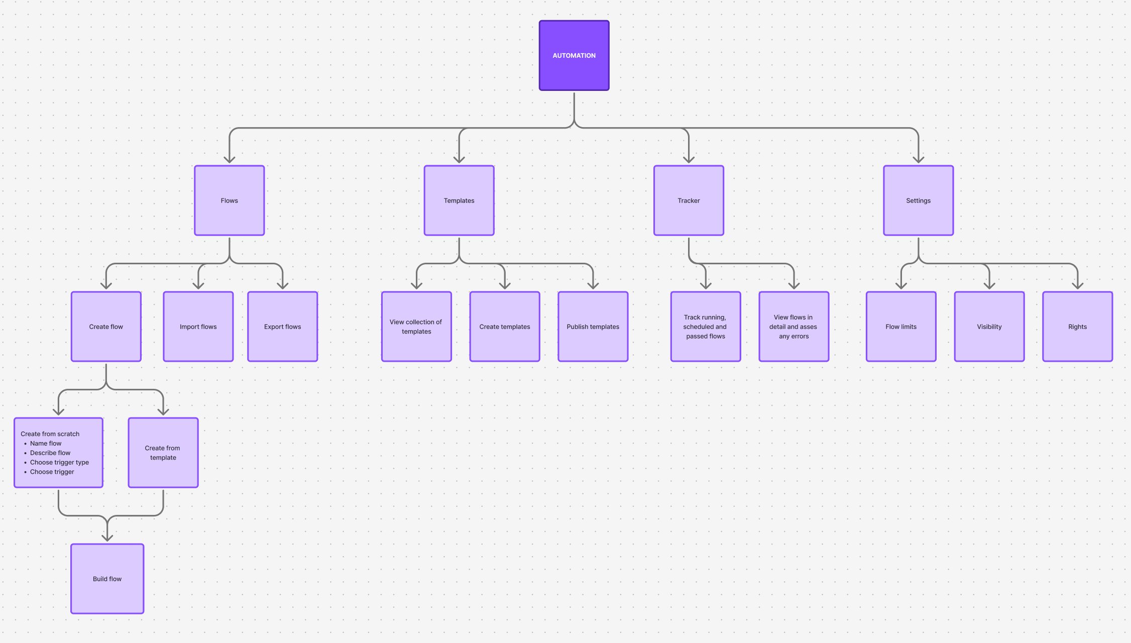
New information architecture — Flows, Templates, Tracker, and Settings unified under a single Automation module
I created early wireframes to validate the overall structure with Product and Engineering — defining the layout for rule creation, establishing visual hierarchy, and aligning on technical feasibility before moving into high-fidelity design. This reduced rework significantly.
I then developed high-fidelity designs in Figma and worked closely with engineering throughout implementation, defining interactions and edge cases, conducting UX reviews, and contributing new components to the design system.
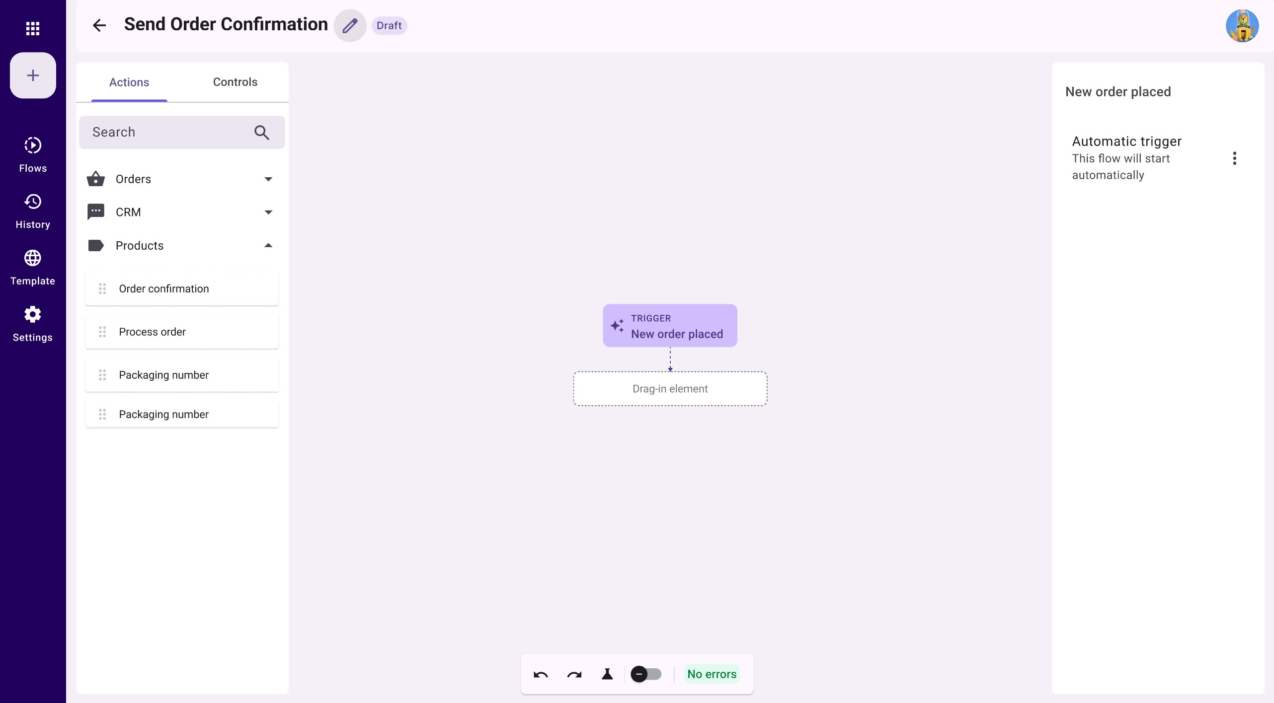
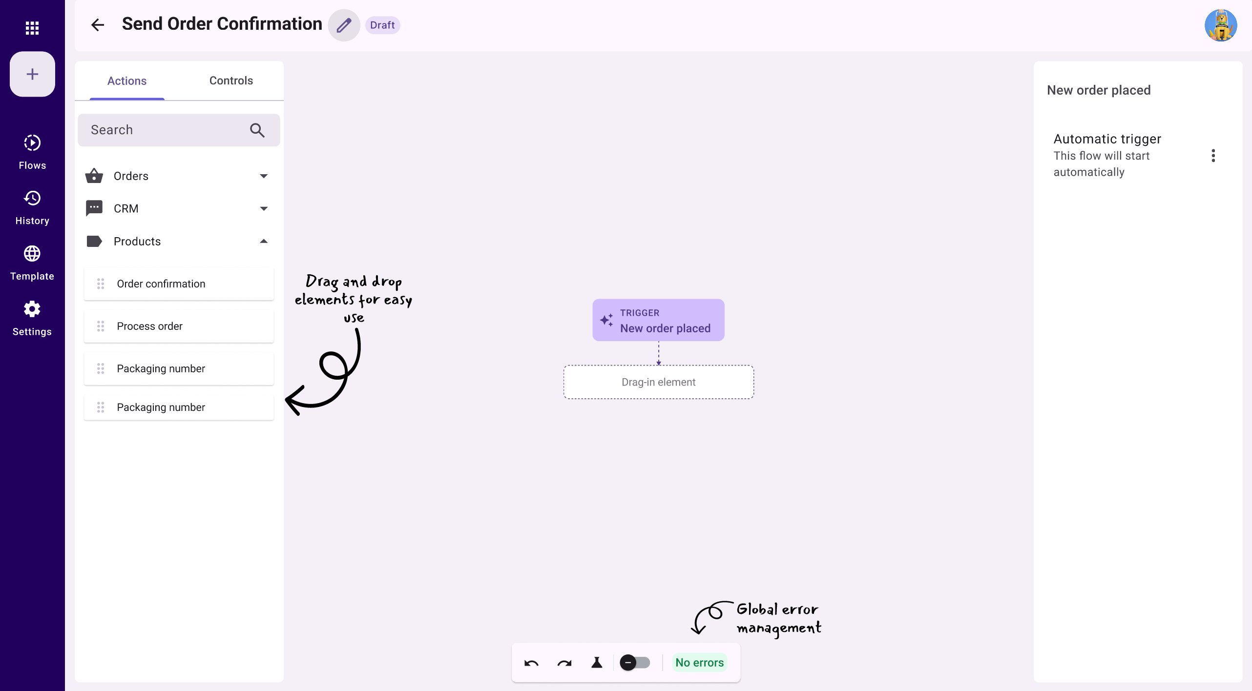
Empty canvas — every flow starts with a single trigger, with a clear drag-in placeholder as the next step
Annotated canvas — drag-and-drop elements from the left panel, global error management always visible in the toolbar
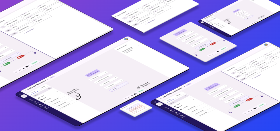
Once users begin building, the canvas grows step by step. The full "Send Order Confirmation" flow illustrates the complete interaction model — from the trigger through sequential actions to a conditional branch.
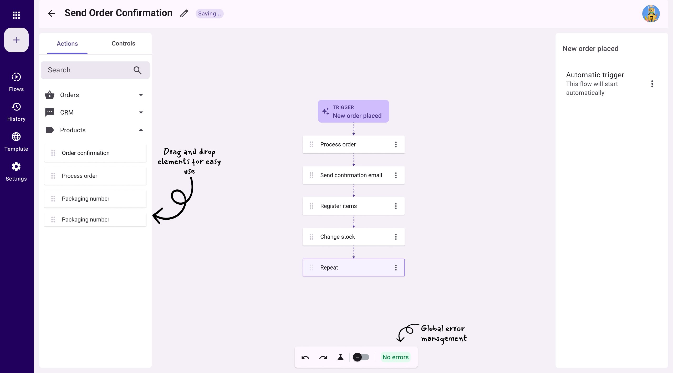
A complete flow — trigger, sequential steps, and a repeat element, with annotations highlighting key interactions
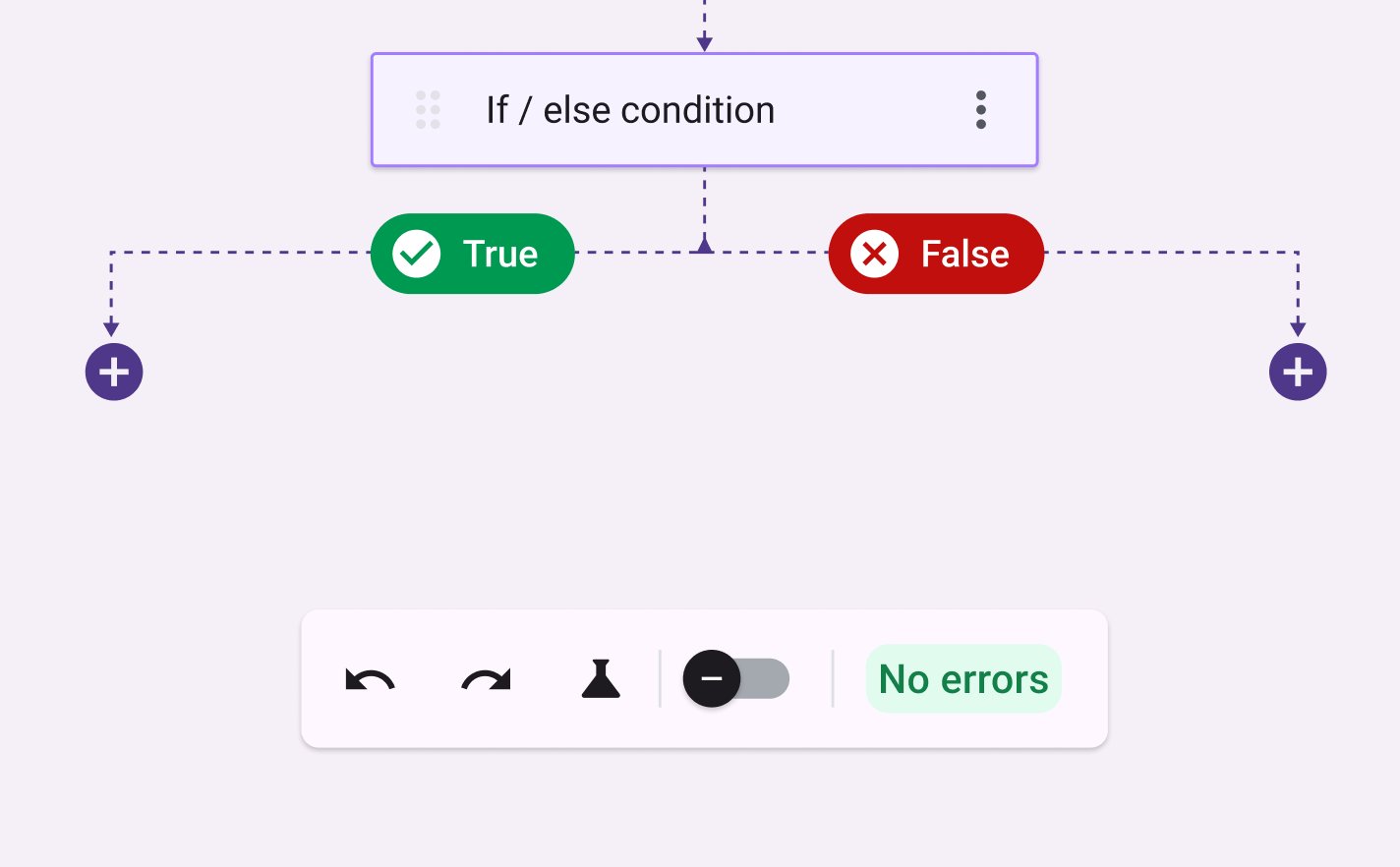
If/else branching — semantic green/red colours immediately communicate the outcome of each path
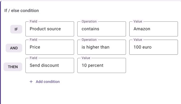
Condition configuration panel — field, operation, value — built for clarity and speed
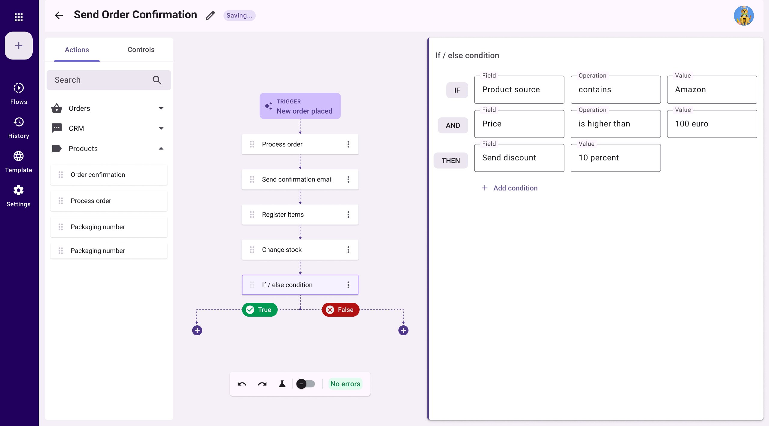
The canvas and configuration panel in context — users can see the full flow while editing a condition, maintaining spatial awareness
A key design decision was using semantic colour to communicate the state of each draggable element — activated, error-activated, and error — so users can diagnose problems at a glance without reading any text.
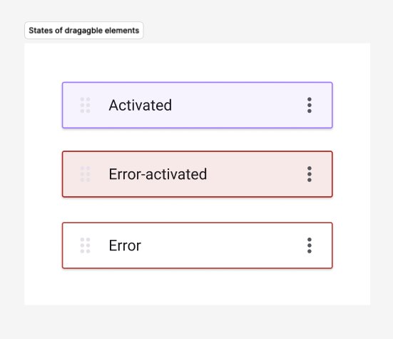
Draggable element states — designed for the component library and contributed to the product design system
Given the timeline constraints, formal usability testing wasn't feasible. Instead, I conducted design review sessions with two experienced customers — walking through the final mockups, explaining the new interaction model, and gathering direct feedback on whether the proposed solution addressed their real workflows.
Both customers oriented themselves quickly without guidance
The step-by-step flow was understood without explanation
Both felt significantly more confident setting up automations independently
New automation described as significantly more intuitive than the system it replaced
Note: These sessions validated the direction but were not a substitute for task-based testing. Formal usability testing is planned as part of the MVP 2 rollout.
The support ticket analysis at the start of this project documented critical workflow failures — shipping delays, broken label creation, users unable to save automations. These formed the benchmark against which the new system was evaluated.
In validation sessions, both users were able to complete a flow setup independently without escalating to support — a task that had previously generated a high volume of tickets. Key account feedback from customer-facing colleagues indicated a consistent shift in sentiment: the new automation was described as significantly more intuitive than the system it replaced.